Consistent · Authentic · Recognizable
Explore the District Brand
The Deer Creek District brand is far more than a logo or color palette. It is the sum of every experience, impression, and connection people have with a place. It tells a story, creates recognition, and builds trust over time. Every interaction, from signage and advertising to social media and events, contributes to how the Deer Creek District is perceived.

As Deer Creek returns as a bold new destination for Noblesville, a consistent brand will help bring that vision to life. By honoring its history while embracing an ambitious future, every touchpoint reinforces Deer Creek District as a place where people gather, explore, and create new connections, building recognition today and a lasting legacy for generations to come.
Deer Creek District
Brand Standard Guide
These brand guidelines exist to help every expression of the Deer Creek District remain consistent, authentic, and recognizable. They provide the tools and standards needed to present a unified identity that reflects the vision for this extraordinary destination while honoring the legacy that makes the Deer Creek name so meaningful.
Primary Logos
The Deer Creek District Primary Logo features a distinctive custom badge shape that reflects the district’s refined, welcoming character. The design combines a deep green field with warm gold and white accents, creating a timeless and sophisticated visual identity.
Deer Creek is prominently displayed in a classic serif typeface, establishing a sense of heritage, quality, and permanence, while “Noblesville” and “District” provide context and balance through clean, understated lettering.
There are two primary versions of the Deer Creek District logo: horizontal and vertical.
There is not a singular preferred version. Choose the horizontal or vertical lockup based on the version that best fits your available space and needs. There are also secondary versions of the logo and additional color options that can be used in certain circumstances.
Secondary Logos
Use the Alternate Logo when the primary logo does not fit the available space, readability requirements, or layout constraints. It provides flexibility while maintaining brand recognition and should only be used in applications where the primary logo is impractical.
The Antler Icon is to be used only in situations where the audience is already aware that the brand is Deer Creek District, like inside pages of a newsletter or a social media avatar, where “Deer Creek District” is the account name.

Logo Color Variations
The full color logo is the preferred version and should be used whenever possible. Use the inverse logo only on dark backgrounds where the full color logo does not provide sufficient contrast. Always select the logo variation that maintains maximum legibility and preserves the integrity of the brand.
When the full color logo cannot be used, use the approved black or white logo versions. The black logo should be used on light backgrounds, and the white logo should be used on dark backgrounds for optimal contrast.


Clear Space
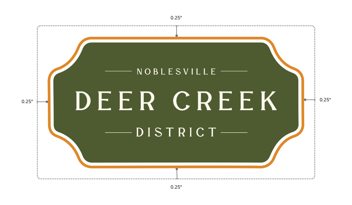
Always maintain clear space around the logo that is free of text, graphics, and other visual elements. This minimum clear space protects the logo’s visibility and impact. As shown in the example to the right, a minimum of 0.25” of clear space must be maintained on all sides of the logo.
Primary Brand Colors
The Deer Creek District primary color palette should be used across all branded materials. These colors are integral to the logo and serve as the foundation of the brand’s visual identity. Use the primary colors as the first choice for all communications and marketing materials.
Hillside Lawn
CMYK: 65, 44, 90, 36
RGB: 78, 90, 49
HEX: 4E5A31
Pantone 574 C
Reflects surrounding landscapes, growth, and the district’s enduring natural character.
Canopy Green
CMYK: 66, 51, 95, 52
RGB: 61, 68, 30
HEX: 3D441E
Pantone 5747 C
Represents mature trees, heritage, stability, and timeless community pride across generations.
Golden Yellow
CMYK: 11, 52, 98, 1
RGB: 223, 147, 42
HEX: DF892A
Pantone 2428 C
Celebrates entertainment, optimism, energy, and memorable experiences that bring people together.
Sunset Orange
CMYK: 7, 87, 100, 1
RGB: 224, 69, 1
HEX: E04501
Pantone 1665 C
Captures vibrant gatherings, creativity, warmth, and the district’s welcoming spirit every season.
Morning Mist
CMYK: 0, 0, 6, 1
RGB: 252, 250, 237
HEX: FCFAED
Pantone P 1-9 C
Provides balance, sophistication, and clarity while enhancing the brand’s timeless elegance.
Primary, secondary, & tertiary colors are available in the Deer Creek Distric Brand Style Guide.
Typography
Deer Creek District uses two fonts: LA DE CHANE and Nunito Sans.
LA DE CHANE Regular, the typeface used in the logo, should be used for headlines and large subheaders.
Nunito Sans, a sans-serif font, should be used for the main body copy and smaller subheaders.
HEADLINE
LA DE CHANE
Header
SUBHEADER
LA DE CHANE
BODY TEXT
Nunito Sans
Subheader
Ellic tem et, que nosae qui sunt vel expere dia ium quam, odiam sitatus sequia cume es aut voluptu saerit aut fugit, quiat.
SMALL SUBHEADER
LA DE CHANE
BODY TEXT
Nunito Sans
Small Subheader
Ellic tem et, que nosae qui sunt vel expere dia ium quam, odiam sitatus sequia cume es aut voluptu saerit aut fugit, quiat.
SMALLER SUBHEADER
LA DE CHANE
BODY TEXT
Nunito Sans
Smaller Subheader
Ellic tem et, que nosae qui sunt vel expere dia ium quam, odiam sitatus sequia cume es aut voluptu saerit aut fugit, quiat.










Pattern
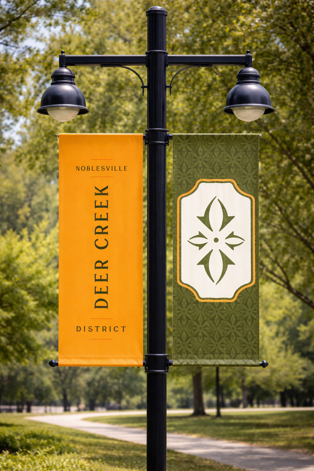
The brand pattern is a supporting visual element that reinforces brand recognition and adds depth to layouts.
It should be used thoughtfully across print and digital applications as a background, accent, or framing device, ensuring it never competes with key content or the logo. The pattern is available in approved brand colorways to maintain consistency while providing flexibility across different communications.
Two pattern styles are provided for different applications: a Bold version for use as a feature graphic or design element, and a Soft version for subtle background applications where content readability is the priority.
Need the full brand kit?
All logo formats, textures, and brand style guides in one folder.
Deer Creek District
FaQ's
What is the Deer Creek District?
Deer Creek District is the brand— name and logo—developed by the City of Noblesville to describe and market a 5,000-acre footprint generally bounded by Interstate 69, Cyntheanne Road, SR 38, 166th Street, and Boden Road. This entire footprint is commonly referred to as “Exit 210.” It currently comprises Hamilton Town Center, Ruoff Music Center, Innovation Mile, Riverview Health Arena, and many more vibrant businesses.
Why the name “Deer Creek District”?
Deer Creek remains a beloved name and conjures pleasant memories of entertainment, fun, and, most importantly, connections. It’s already used to describe the development footprint, and it still has equity.
Why develop a brand?
The area is thriving and growing. It’s vibrant. But it needs a brand to aid in its marketing so we can capitalize on this success. And now is the time to do this.
How do I use the brand?
In short, you would use the name of your company or organization, followed by “at Deer Creek District.” Please refer to the Brand Style Guide and tools to assist you in using the Deer Creek District brand and will be here to provide whatever support you need.
What is the status of the buildout of this footprint?
Our vision for Deer Creek District is bold, comprehensive, and innovative. Our blueprint is being informed by a wide range of individuals, businesses and organizations. But vision on this scale takes time. With every step, we are building Noblesville’s future as a go-to destination for local residents and regional visitors.
Who developed the “Deer Creek District” brand?
The brand was developed by the City of Noblesville in partnership with Hamilton County Tourism after a collaborative effort with key stakeholders, residents, and developers in the area.
Will businesses be required to use the brand and update their signage?
We believe the brand will benefit businesses as well as the overall district, and we encourage you to use it consistent with the branding guidelines.